Web overview
Components are the non-contextualized building blocks of a design system, built to solve specific UI problems. Fluent Web is available for both Web Components and React for consistent web experiences, no matter the tech.
Need to get set up first? Check out the get started guides.
Resources
Components


Accordion
An accordion groups sections of related content that can be opened and closed.

Avatar
An avatar shows an image or text to represent a person or group as well as give additional information like their status and activity.
Avatar group
An avatar group shows multiple avatars.
Badge
A badge is a visual indicator that communicates a status or description of an associated component.
Breadcrumb
A breadcrumb helps people understand and move through the hierarchy of a complex site or app.
Button
A button triggers a single action or event.
Card
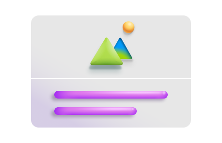
A card is a container that holds information and actions related to a single concept or object, like a document or a contact.
Carousel
A carousel is a dynamic component that lets users cycle through content, like featured articles, products, or services, without leaving the current page.
Checkbox
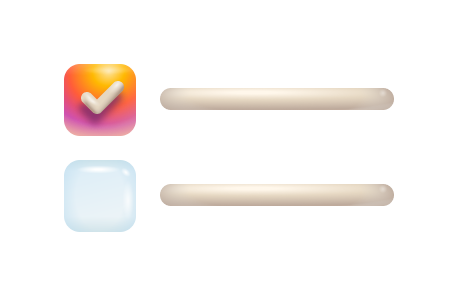
Checkboxes let people select multiple options from a group or switch a single option on or off.
Combobox
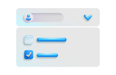
A combobox lets people choose one or more options from a list or enter text in a connected input.
Dialog
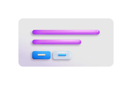
A dialog is a supplemental surface that can provide helpful interactions or require someone to take an action before they can continue their task, like confirming a deletion.
Divider
A divider groups sections of content to create visual rhythm and hierarchy.
Drawer
A drawer is a secondary content surface that slides in from one edge of a layout.
Dropdown
A dropdown lets people choose one or more options from a list.
Field
A field is a combination of a label and any form component, like an input or a select.
Fluent provider
The Fluent provider defines the styles that are used in your app.
Icon
Icons represent concepts, objects, or actions, and have semantic purpose within a layout.
Image
Images, like photos and illustrations, help reinforce a message and express your product or app's style.
Info label
An info label is a label paired with an info button that shows additional content in a popover when selected.
Input
An input allows people to enter short, free-form text data.
Label
Labels give a name to a component or group of components.
Link
A link is interactive text that lets people navigate somewhere else, either within an experience or to a different app or site.
List
A list is a collection of like items or information repeated in a vertical stack.
Menu
A menu is a hidden list of options that is shown when someone interacts with a trigger component, like a button, an avatar, or an icon.
Message bar
A message bar communicates important information about the state of the entire product or the surface where it appears, such as a page, drawer, dialog, or card.
Nav
Nav, or navigation, provides a list of links that lets people move through the main sections of an app or site.
Persona
A persona is a representation of a person with additional contextual information.
Popover
A popover is a small surface that appears when someone interacts with a component to give nonessential, contextual information without blocking them.
Progress bar
Progress bars communicate system information, like how much cloud storage someone is using in OneDrive, or task information, like how long until a download is complete.
Radio group
Radio groups let people select a single item from a short list.
Rating
Rating is used to communicate user sentiment.
Searchbox
.
Select
A select lets people choose a single option from a list of at least four options.
Skeleton
A skeleton lets people know that a section of content is loading without blocking other parts of the page.
Slider
A slider lets someone set a value from a given range.
Spin button
A spin button is a specialized input that lets someone easily increase or decrease a value within a set range, like dates in a month.

Spinner
Spinners visually communicate that something is processing.
Switch
A switch lets someone choose between two mutually exclusive options, like on or off.
Tablist
A tablist allows people to switch between categories of related information without going to different pages.
Tag
A tag is a representation of a value that someone has picked, like recipients for an email or categories on a planner task.
Tag picker
A Tag picker combines a text input and a dropdown giving people a way to select an option from a list or enter their own choice.
Text
The text component codifies Fluent's opinions on typography to make them easy to use and standardize across products.
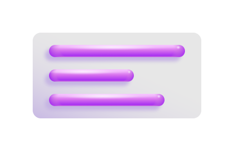
Textarea
A textarea allows people to enter long, free-form text data, like a comment.
Toast
A toast communicates the status of an action someone is trying to take or that something happened elsewhere in the app.
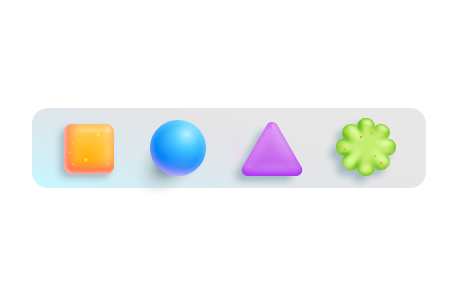
Toolbar
A toolbar gives access to frequently used actions related to someone’s current view or task, like text formatting in an editor.
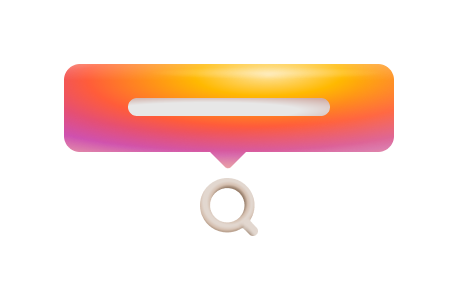
Tooltip
A tooltip provides supplemental, contextual information elevated near its target component.
Tree
A tree is used to display a hierarchical view of nested data.